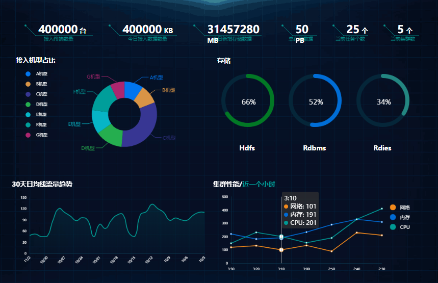
jQuery tooltipster提示框特效代码下载

代码结构
1. 引入CSS
<link rel="stylesheet" type="text/css" href="css/reset.css" /><link rel="stylesheet" type="text/css" href="css/prettify.css" /><link rel="stylesheet" type="text/css" href="css/style.css" /><link rel="stylesheet" type="text/css" href="css/tooltipster.bundle.min.css" /><link rel="stylesheet" type="text/css" href="css/plugins/tooltipster/sideTip/themes/tooltipster-sideTip-borderless.min.css" /><link rel="stylesheet" type="text/css" href="css/plugins/tooltipster/sideTip/themes/tooltipster-sideTip-light.min.css" /><link rel="stylesheet" type="text/css" href="css/plugins/tooltipster/sideTip/themes/tooltipster-sideTip-noir.min.css" /><link rel="stylesheet" type="text/css" href="css/plugins/tooltipster/sideTip/themes/tooltipster-sideTip-punk.min.css" /><link rel="stylesheet" type="text/css" href="css/plugins/tooltipster/sideTip/themes/tooltipster-sideTip-shadow.min.css" /><link rel="stylesheet" type="text/css" href="css/tooltipster-follower.min.css" /><link rel="stylesheet" href="css/jquery-ui.min.css">
2. 引入JS
<script type="text/javascript" src="js/jquery.min.js"></script><script type="text/javascript" src="js/tooltipster.bundle.js"></script><script type="text/javascript" src="js/tooltipster-follower.min.js"></script><script type="text/javascript" src="js/tooltipster-discovery.min.js"></script><script type="text/javascript" src="js/scripts.js"></script><script type="text/javascript" src="js/jquery-ui.min.js"></script><script type="text/javascript" src="js/jquery.ui.touch-punch.min.js"></script><script type="text/javascript" src="js/prettify.js"></script><script src="http://www.jq22.com/jquery/html5.min.js"></script>
3. HTML代码
<div id="background"> <img src="images/large-background.jpg" /></div><div id="wrapper"> <section id="welcome"> <img src="images/tooltipster.svg" alt="Tooltipster" id="tooltipster" /> <h1> 一款基于JQ,灵活可扩展的插件<br /> 简单,强大,能胜任一切 </h1> <div id="browsers"> <img src="images/browser-chrome.png" alt="Chrome" class="tooltip" title="Chrome Support" /> <img src="images/browser-firefox.png" alt="FireFox" class="tooltip" title="FireFox Support" /> <img src="images/browser-opera.png" alt="Opera" class="tooltip" title="Opera Support" /> <img src="images/browser-safari.png" alt="Safari" class="tooltip" title="Safari Support" /> <img src="images/browser-ie.png" alt="Internet Explorer" class="tooltip" title="IE6+ support" /> </div> </section> <section id="demos"> <h2>Demos</h2> <ul> <li> <span id="demo-default" title="Hi! I am a tooltip.">Hover</span> 默认设置 </li> <li id="test"> <span id="demo-events" title="你可以通过键盘按键或点击任何地方关闭">Click</span> 自定义打开/关闭触发器 </li> <li> <span id="demo-html" data-tooltip-content="#demo-html-content">Hover</span> 一侧显示 </li> <li> <span id="demo-smart">Drag</span> 拖动,智能定位 </li> <li> <span id="demo-touch">Click</span> 鼠标、触摸和混合设备 </li> <li> <span id="demo-theme" title="Build custom themes and CSS powered animations!">Hover</span> 自定义主题 & 动画 </li> <li> <span id="demo-callback" title="This will be populated by AJAX.">Hover</span> 自定义回调 (AJAX <3) </li> <li> <span id="demo-interact" title="Try clicking <a href='http://google.com/' target='_blank'>this link</a>">Hover</span> 交互提示 </li> <li> <span id="demo-imagemap"> <img id="demo-imagemapped" src="./images/star.png" usemap="#imagemap" /> <map name="imagemap"> <area id="demo-imagemaparea" title="The tooltip triggers only on a given image area" shape="poly" coords="20,17,26,0,32,17,48,16,36,29,40,45,27,36,11,45,16,29,2,17" /> </map> </span> 支持图像映像 & SVG </li> <li> <span id="demo-multiple">Hover</span> 单个标签多元提醒 </li> <li id="demo-complex-li"> <span id="demo-complex-placeholder"></span> <span id="demo-complex" title="我已经被固定,尝试滚动鼠标,点击圆块取消">Click</span> 位置跟踪功能 </li> <li> <span id="demo-position" data-tooltip-content="#demo-position-content">Hover</span> <div id="demo-position-grid">Custom position</div> </li> <li> <span id="demo-plugin" title="I use a plugin to follow the mouse!">Hover</span> 跟随鼠标 </li> <li>...& more!</li> </ul> <br class="clear" /> </section> <div id="templates"> <div id="demo-html-content"> <img src="images/spiderman.png" width="50" height="50" /> <p style="text-align:left;"> <strong>Lorem ipsum dolor sit amet</strong><br /> Duis aute irure dolor in reprehenderit in voluptate velit esse cillum dolore eu. </p> </div> <span id="demo-position-content">I'm the most accurate tooltip ever! Let me fit to your layout the way you want to. I'm great to create menus too :)</span> </div> <section id="getting-started"> <h2>Getting Started <a href="#">⇑</a></h2> <h3>1. 引入jQuery和Tooltipster's文件</h3> <p>你可以 <a href="http://www.wangzhanmuban.cn/">网站模板</a>, 引入 jQuery 和 Tooltipster's CSS 还有 JavaScript 文件在你的页面<br /></p><pre class="prettyprint"><head><link rel="stylesheet" type="text/css" href="tooltipster/css/tooltipster.bundle.min.css" /><script type="text/javascript" src="http://code.jquery.com/jquery-1.10.0.min.js"></script><script type="text/javascript" src="tooltipster/js/tooltipster.bundle.min.js"></script></head></pre> <p>兼容提醒: jQuery 1.7已经足够了,除非你需要SVG兼容IE(需要使用jQuery 1.10+). Tooltipster 不能正常运行在IE9中引用jQuery1.8</p> <h3>2. 设置你的HTML</h3> <p>想让一个元素加入工具提醒, 我们会给他加上一个类名class <span class="code">'tooltip'</span> . 你也可以选择使用自定义的类名或选择器(请继续往下看), 由你决定. 之后, 我们将设置标题<span class="code">title</span> 属性为我们想要的提示. 这里有几个栗子:</p> <pre class="prettyprint">// 在图片加入工具提醒:<img src="my-image.png" class="tooltip" title="This is my image's tooltip message!" />// 在文字加入工具提醒 (span, div or whatever):<span class="tooltip" title="This is my span's tooltip message!">Some text</span></pre> <p>注意:如果您使用Twitter's Bootstrap,请使用另一个类名,因为“工具提示”会产生冲突。</p> <h3>3. 激活 Tooltipster</h3> <p>我们要做的最后一件事是激活Tooltipster. 我们需要在头部得问 <span class="code"></head></span> 标签加入script并激活Tooltipster (你可以选择使用自己定义的选择器 - 我们的栗子是使用 <span class="code">'tooltip'</span> class):</p> <pre class="prettyprint"><head>...<script> $(document).ready(function() { $('.tooltip').tooltipster(); });</script></head></pre> <h3 id="theming">4. 定义你的tooltips风格</h3> <p>第一个是默认样式, Tooltipster还为你提供另外五种主题风格.</p> <div id="themes"> <div class="tooltipster-default-preview tooltip" title="The default style" target="_blank">Default</div> <div class="tooltipster-light-preview" title="Light and frisky!" target="_blank">Light</div> <div class="tooltipster-borderless-preview" title="Let's travel!" target="_blank">Borderless</div> <div class="tooltipster-punk-preview" title="I will not conform to your old fart ways!" target="_blank">Punk</div> <div class="tooltipster-noir-preview" title="Hipsterific!" target="_blank">Noir</div> <div class="tooltipster-shadow-preview" title="Hey, I have a smaller arrow" target="_blank">Shadow</div> </div> <p> 要使用这些主题,需要引用一个css文件 (他的路径是 <span class="code">css/plugins/tooltipster/sideTip/themes</span> 文件里) 在你的页面并指定其名称在Tooltipster's 选项</p> <pre class="prettyprint">$('.tooltip').tooltipster({theme: 'tooltipster-noir' //使用Noir主题});</pre> <p>你可以通过修改tooltips的样式达到你想要的效果, <a href="#styling">自定义主题部分</a> 在下面等着你.</p> <p>注: "sideTip" 是 Tooltipster默认插件的名称. 我们稍后会看到这个插件.</p> <h3 id="html">5. 在HTML内使用你的tooltips</h3> <p>Tooltipster 允许你使用任何HTML标记触发提醒. 这意味着可以插入像图像和文本格式标记之类的东西。.</p> <p>代替之前加入的<span class="code">title</span> 属性, 这次我们使用 <span class="code">data-tooltip-content</span> 属性来提供与HTML页面内对应的元素选择器,该元素作为内容显示. 栗子如下:</p> <pre class="prettyprint"><span class="tooltip" data-tooltip-content="#tooltip_content">This span has a tooltip with HTML when you hover over it!</span><div class="tooltip_templates"><span id="tooltip_content"> <img src="myimage.png" /> <strong>This is the content of my tooltip!</strong></span></div></pre> <p>在你的CSS文件, 加入 <span class="code">.tooltip_templates { display: none; }</span> 这样内容不会在工具提示之外显示出来.</p> <p>重点: 如果你有两个(或以上)的tooltips有相同的 <span class="code">data-tooltip-content</span> 属性 (也就是说, 你想用一样的HTML元素), 请将 <span class="code">contentCloning</span> 选项设置为 <span class="code">true</span> 当你初始化你的tooltips:</p> <pre class="prettyprint">$('.tooltip').tooltipster({contentCloning: true});</pre> <p>注: 其实还有其他设置提醒内容的<a href="http://www.wangzhanmuban.cn/">网站模板</a>.</p> <h3>6. 使用插件</h3> <p> Tooltipster的功能可以通过插件扩展.他们可能会增加新的风格,新的选择,新的方法,新的行为,等等.<br /> Tooltipster的一些流行插件: </p> <p><span class="code">sideTip</span> Tooltipster附带的和默认启动的</p> <p><span class="code">SVG</span> Tooltipster附带的, 增加了 SVG 支持, 但是默认情况是不启动的 (详情见<a href="#svg">SVG section</a>)</p> <p><span class="code">follower</span> 让工具提示跟随光标 <a href="http://www.wangzhanmuban.cn/">网站模板</a></p> <p><span class="code">scrollableTip</span> 使工具提示增加滚动条当内容过多. <a href="http://www.wangzhanmuban.cn/">网站模板</a></p> <p><span class="code">discovery</span> 创建工具提示组更快显示 ,在<a href="#grouped">分组提示</a> 部分显示, <a href="http://www.wangzhanmuban.cn/">网站模板</a></p> <p><span class="code">selectableText</span> 当你选择/高亮某段文字,让工具提醒显示. <a href="http://www.wangzhanmuban.cn/">网站模板</a></p> <p>有关插件的更多信息,请阅读我们的。<a href="#plugins">插件部分</a>.</p> </section> <section id="options"> <h2>参数 <a href="#">⇑</a></h2> <p>Tooltipster 的参数(选项)给你一个宽阔的可变范围来调整成你心仪的提醒. 这里教你如何配置参数:</p> <pre class="prettyprint">$('.tooltip').tooltipster({animation: 'fade',delay: 200,theme: 'tooltipster-punk',trigger: 'click'});</pre> <p>这里是全部可用参数的列表:</p> <table id="table_options" border="0" cellpadding="0" cellspacing="0"> <tr> <td><b>参数</b></td> <td><b>可用的值</b></td> <td><b>描述</b></td> </tr> <tr> <td><h4>animation</h4></td> <td>'fade',<br /> 'grow',<br /> 'swing',<br /> 'slide',<br /> 'fall'</td> <td>决定tooltips进场的动画. 除了内置的动画, 你也可以创建自定义动画在你的CSS文件. 在IE9及以下, 所有动画默认为javascript生成淡入动画. <strong>默认值: 'fade'</strong></td> </tr> <tr> <td><h4>animationDuration</h4></td> <td>integer,<br />integer[]</td> <td>设置动画的持续时间, 以毫秒为单位. 如果你想为你的tooltips打开/关闭提供不同的持续时间, 你可以提供一个数组来表示不同的值(如:integer[400,500]). <strong>默认值: 350</strong></td> </tr> <tr> <td><h4>arrow</h4></td> <td>boolean</td> <td>给你的tooltips加一个"气泡" 箭头. <strong>默认值: true</strong></td> </tr> <tr> <td><h4>content</h4></td> <td>string,<br />jQuery object,<br />any</td> <td>如果设置了, 将会覆盖tooltips的内容. 如果您提供的内容不是字符串或jQuery封装的HTML元素,你需要使用'functionFormat'这个参数来格式化你的内容以达到显示效果<strong>默认值: null</strong></td> </tr> <tr> <td><h4>contentAsHTML</h4></td> <td>boolean</td> <td>如果tooltip的内容是字符串, 会默认显示为纯文本. 如果想将内容解析为HTML, 请将这个参数设为true. <strong>默认值: false</strong></td> </tr> <tr> <td><h4>contentCloning</h4></td> <td>boolean</td> <td>如果你提供了一个JQ对象给'content'这个参数,如果这个克隆对象应该被使用,则设置此参数.<strong>默认值: false</strong></td> </tr> <tr> <td><h4>debug</h4></td> <td>boolean</td> <td>当你做了你不应该做的事情,tooltipster日志提醒和通知会在控制台报错,如果你设置了false便可以禁用日志记录<strong>默认值: true</strong></td> </tr> <tr> <td><h4>delay</h4></td> <td>integer,<br />integer[]</td> <td>在鼠标交互的时候,这个属性是在hover/trigger..触发tooltip开始打开或者关闭动画使用时生效(简单来说就是一个延时器)<span class="tooltip" title="More specifically: when the 'triggerOpen.mouseenter' and/or 'triggerClose.mouseleave' are used">(<span class="red">*</span>)</span>. 如果你想为你的tooltips打开/关闭提供不同的持续时间, 你可以提供一个数组来表示不同的值(如:integer[400,500]).<strong>默认值: 300</strong></td> </tr> <tr> <td><h4>delayTouch</h4></td> <td>integer,<br />integer[]</td> <td>在触摸交互的时候, 同上<span class="tooltip" title="More specifically: when the 'triggerOpen.touchstart' and/or 'triggerClose.touchleave' are used">(<span class="red">*</span>)</span>.如果你想为你的tooltips打开/关闭提供不同的持续时间, 你可以提供一个数组来表示不同的值(如:integer[400,500]). <strong>默认值: [300, 500]</strong></td> </tr> <tr> <td><h4>distance</h4></td> <td>integer,<br />integer[]</td> <td>以像素为单位,远点到提醒工具的距离.如果您希望为每个边指定不同的距离,则该值可以是整数或整数数组(通常为CSS语法)。 <strong>默认值: 6</strong></td> </tr> <tr> <td><h4>functionInit</h4></td> <td>function</td> <td>在实例化时只被触发一次的自定义函数. <a href="#callback_arguments">Arguments</a>. <strong>默认值: none (null)</strong></td> </tr> <tr> <td><h4>functionBefore</h4></td> <td>function</td> <td>在打开工具提示之前要触发的自定义函数. 这个发方法会阻止tooltip打开如果返回false.<a href="#callback_arguments">Arguments</a>. <strong>默认值: none (null)</strong></td> </tr> <tr> <td><h4>functionReady</h4></td> <td>function</td> <td>当工具提示及其内容被添加到DOM时,将触发自定义函数. <a href="#callback_arguments">Arguments</a>. <strong>默认值: none (null)</strong></td> </tr> <tr> <td><h4>functionAfter</h4></td> <td>function</td> <td>一旦工具提示已关闭并从DOM中移除,则将定制一个函数.<a href="#callback_arguments">Arguments</a>. <strong>默认值: none (null)</strong></td> </tr> <tr> <td><h4>functionFormat</h4></td> <td>function</td> <td>格式化内容的函数.它得到两个第一个通常的<a href="#callback_arguments">参数</a>和第三个参数的内容。它必须返回在工具提示中显示的值,无论是字符串还是jQuery封装的HTML元素(请参阅<a href="#formatting">格式化部分</a>). <strong>默认值: none (null)</strong></td> </tr> <tr> <td><h4>functionPosition</h4></td> <td>function</td> <td>当tooltip重新定位时触发的自定义函数,它给你轻微或完全修改的位置,Tooltipster是要给tooltip的能力,它将建议的放置值集设置为第三个参数.函数必须返回您可能编辑过的位置值集合(请参阅<a href="#positioning">定位部分</a>). <strong>默认值: none (null)</strong></td> </tr> <tr> <td><h4>IEmin</h4></td> <td>integer</td> <td>要运行的IE的最低版本. <strong>默认值: 6</strong></td> </tr> <tr> <td><h4>interactive</h4></td> <td>boolean</td> <td>在工具提醒给用户尽可能多的交互.如果你想他们在工具提醒内容可以点击,填写表格或者其他交互,你就必须把这个参数设置为true.当使用“悬停”关闭触发器时,用户必须在开始关闭之前将光标移到工具提示上(此时间间隔由“delay”参数设置). <strong>默认值: false</strong></td> </tr> <tr> <td><h4>maxWidth</h4></td> <td>integer</td> <td>设置tooltip的最大宽度. <strong>默认值: null (无限制)</strong></td> </tr> <tr> <td><h4>minIntersection</h4></td> <td>integer</td> <td>对应于箭头中心和工具提示边缘之间强制执行的最小距离. 主要用于创建大于默认主题的箭头. <strong>默认值: 16</strong></td> </tr> <tr> <td><h4>minWidth</h4></td> <td>integer</td> <td>设置tooltip的最小宽度.<strong>默认值: 0 (auto width)</strong></td> </tr> <tr> <td><h4>multiple</h4></td> <td>boolean</td> <td>允许你把几个提示在一个单一的元素 (详见 <a href="#multiple">multiple 部分</a>). <strong>默认值: false</strong></td> </tr> <tr> <td><h4>plugins</h4></td> <td>string[]</td> <td>设置使用Tooltipster的插件名. <strong>默认值: ['sideTip']</strong></td> </tr> <tr> <td><h4>repositionOnScroll</h4></td> <td>boolean</td> <td>为了使tooltip尽可能长时间可见,重新定位tooltip如果它在用户滚动页面时退出视窗. <strong>默认值: false</strong></td> </tr> <tr> <td><h4>restoration</h4></td> <td>'none',<br />'previous',<br />'current'</td> <td>指定在调用“销毁”方法后,是否应该在HTML元素上恢复title属性.这个属性可以省略,或是在Tooltipster之前初始化存在的值恢复,或是与字符串化值的当前内容恢复.注意:在多个工具提示的情况下在一个单一的元素,只有最后的破坏可能会触发恢复提示. <strong>默认值: 'none'</strong></td> </tr> <tr> <td><h4>selfDestruction</h4></td> <td>boolean</td> <td>在这个原点从DOM移除后,设置这个参数是否将tooltip自毁.这可以防止内存泄露. <strong>默认值: true</strong></td> </tr> <tr> <td><h4>side</h4></td> <td>string,<br />string[]</td> <td>设置tooltip在哪侧显示. 这个值可能是一个: 'top', 'bottom', 'left', 'right'. 也可以是一个数组包括多个值. 当使用数组时,这些值的顺序要考虑到回退顺序和禁用没有用到的一侧 (see the <a href="#sides">sides section</a>). <strong>默认值: ['top', 'bottom', 'right', 'left']</strong></td> </tr> <tr> <td><h4>timer</h4></td> <td>integer</td> <td>设置这个工具提醒在关闭前的显示时间(以毫秒为单位) <strong>默认值: 0 (disabled)</strong></td> </tr> <tr> <td><h4>theme</h4></td> <td>string,<br />string[]</td> <td>设置一个将覆盖默认工具提示外观的主题. 你可以提供多个字符串的数组来同时应用多个主题Y(详见 <a href="#theming">主题部分</a>). <strong>默认值: empty array</strong></td> </tr> <tr> <td><h4>trackerInterval</h4></td> <td>integer</td> <td>设置追踪程序持续时间/毫秒(见trackOrigin 和 trackTooltip).当工具提醒被打开,即使trackOrigin和trackTooltip设置为false,追踪器运行会检查起点是否被移除,如非必要,你定的值不能太高或太低. <strong>默认值: 500</strong></td> </tr> <tr> <td><h4>trackOrigin</h4></td> <td>boolean</td> <td>如果原点移动或调整大小需要复位提醒.由于此选项可能对性能有影响,我们建议您仅在需要时启用它. <strong>默认值: false</strong></td> </tr> <tr> <td><h4>trackTooltip</h4></td> <td>boolean</td> <td>如果tooltip改变大小则重新配置tooltip.当尺寸受到'content'这个方法而改变尺寸,tooltip已经重新定位而不需要这个参数。由于此选项可能对性能有影响,我们建议您仅在需要时启用它。详情进入<a href="#faq_sizeissue">这个入口</a> 有常见问题解答 <strong>默认值: false</strong></td> </tr> <tr> <td><h4>trigger</h4></td> <td>'hover',<br />'click',<br />'custom'</td> <td>设置这个触发条件,有'click','hover',还可以自定义以达到你想要的效果. 见 <a href="#triggers">触发器部分</a> 来学习如何使用自定义触发器. <strong>默认值: 'hover'</strong></td> </tr> <tr> <td><h4>triggerClose</h4></td> <td>object</td> <td>当你把'trigger'设置为'custom',所有内置关闭触发器都默认不可用,此参数就是允许您激活您所选择的触发器来创建一个定制的行为,只在设置'trigger'为'custom'时有效。 <a href="#triggers">详见触发器部分</a>.</td> </tr> <tr> <td><h4>triggerOpen</h4></td> <td>object</td> <td>类似于'triggerClose'(同上).</td> </tr> <tr> <td><h4>updateAnimation</h4></td> <td>'fade',<br />'rotate',<br />'scale',<br />null</td> <td>用于打开tooltip后的后续动画设置,你可以创建自己的动画在您的CSS文件内但是要将值设为'null'. <strong>默认值: 'rotate'</strong></td> </tr> <tr> <td><h4>viewportAware</h4></td> <td>boolean</td> <td>尝试将tooltip放置在屏幕打开时完全可见的地方,如果工具提示在其源于屏幕之外(使用方法调用)打开时,您可能希望将此选项设置为false。<strong>默认值: true</strong></td> </tr> <tr> <td><h4>zIndex</h4></td> <td>integer</td> <td>设置tooltip的z-index<strong>默认值: 9999999</strong></td> </tr> </table> <br /><br /> <h3 id="callback_arguments">传递给回调函数的参数</h3> <p>几乎所有用户的回调函数有相同的特征. 这意味着 <span class="code">functionInit</span>, <span class="code">functionBefore</span>, <span class="code">functionReady</span>, <span class="code">functionAfter</span>, <span class="code">functionFormat</span>, <span class="code">functionPosition</span> and the <span class="code">open</span> and <span class="code">close</span> 回调都得到了这两个参数:</p> <pre class="prettyprint">// this is valid for the other callback functions toofunctionInit(instance, helper){...}</pre> <p>小例外: <span class="code">functionFormat</span> 和 <span class="code">functionPosition</span> 获取额外的第三个参数(以上记载)。</p> <p><span class="code">instance</span> 是调用回调函数对象和Tooltipster <a href="#object-oriented">面向对象部分object-oriented section</a>的描述.</p> <p><span class="code">helper</span> 是一个对象,其中包含您可能会发现有用的变量. For example:</p> <p><span class="code">helper.origin</span> is always present, it's the HTML element on which the tooltip is set.</p> <p><span class="code">helper.tooltip</span> is present in <span class="code">functionReady</span> and <span class="code">open</span> callbacks, it's the root HTML element of the tooltip. In other callbacks, it is <span class="code">undefined</span>.</p> <p><span class="code">helper.event</span> is present in <span class="code">functionBefore</span> and <span class="code">functionAfter</span> callbacks. It's the mouse or touch event that triggered the opening or the closing of the tooltip. When the action was not triggered by a mouse or touch event, this variable is <span class="code">null</span> or <span class="code">undefined</span>.</p> </section> <section id="methods"> <h2>Methods <a href="#">⇑</a></h2> <p>For advanced use cases, Tooltipster offers a set of methods to manipulate your tooltips. They allow you to create custom triggers, update tooltip content on the fly (whether the tooltip is currently open or not), destroy Tooltipster functionality if needed, reposition tooltips and more.</p> <h3 id="instance_methods">Instance methods</h3> <p>Instance methods are used to manipulate one tooltip in particular. There are two ways to call them.</p> <p>1) Through the origin's HTML element: <span class="code">$('#my-tooltip').tooltipster(methodName [, argument1] [, argument2]);</span></p> <p>2) Through the tooltip instance, when you have it: <span class="code">instance.methodName([argument1] [, argument2]);</span></p> <p>The latter will be discussed in the <a href="#object-oriented">object-oriented section</a>. Users with simple use cases just need to know that it's the recommended way of calling methods when you are inside <span class="code">functionInit</span>, <span class="code">functionBefore</span> and the like. Here is the list of instance methods:</p> <br /><br /> <table class="table_methods" border="0" cellpadding="0" cellspacing="0"> <tr> <td><b>Method name</b></td> <td><b>Arguments</b></td> <td><b>Description</b></td> </tr> <tr> <td><h4>close</h4></td> <td>callback</td> <td>Closes the tooltip. When the animation is over, its HTML element is destroyed (definitely removed from the DOM). The `callback` function argument is optional (see its <a href="#callback_arguments">input signature</a>).</td> </tr> <tr> <td><h4>content (getter)</h4></td> <td>None</td> <td>Returns a tooltip's current content. If the selector matches multiple origins, only the value of the first will be returned.</td> </tr> <tr> <td><h4>content (setter)</h4></td> <td>content</td> <td>Updates the tooltip's content.</td> </tr> <tr> <td><h4>destroy</h4></td> <td>None</td> <td>Closes and destroys the tooltip functionality.</td> </tr> <tr> <td><h4>disable</h4></td> <td>None</td> <td>Temporarily disables a tooltip from being able to open.</td> </tr> <tr> <td><h4>elementOrigin</h4></td> <td>None</td> <td>Returns the HTML element which has been tooltipped.</td> </tr> <tr> <td><h4>elementTooltip</h4></td> <td>None</td> <td>Returns the HTML root element of the tooltip if it is open, `null` if it is closed.</td> </tr> <tr> <td><h4>enable</h4></td> <td>None</td> <td>If a tooltip was disabled, restores its previous functionality.</td> </tr> <tr> <td><h4>instance</h4></td> <td>None</td> <td>Returns the instance of Tooltipster associated to the tooltip. If the selector matches multiple origins, only the instance of the first will be returned.</td> </tr> <tr> <td><h4>on, one, off, triggerHandler</h4></td> <td>callback</td> <td>Handle Tooltipster's events on a per-instance basis (see the <a href="#events">events section</a>).</td> </tr> <tr> <td><h4>open</h4></td> <td>callback</td> <td>Opens the tooltip. The `callback` function argument is optional (see its <a href="#callback_arguments">input signature</a>) and, if provided, is called when the opening animation has ended.</td> </tr> <tr> <td><h4>option (getter)</h4></td> <td>optionName</td> <td>Returns the value of an option.</td> </tr> <tr> <td><h4>option (setter)</h4></td> <td>optionName, optionValue</td> <td>Sets the value of an option (for advanced users only; we do not provide support on unexpected results).</td> </tr> <tr> <td><h4>reposition</h4></td> <td>None</td> <td>Resizes and repositions the tooltip.</td> </tr> <tr> <td><h4>status</h4></td> <td>None</td> <td>Returns various information about the tooltip, like whether it is open or not. See the <a href="#status">status section</a>.</td> </tr> </table> <br /><br /> <p>Example of the first syntax:</p> <pre class="prettyprint">// initialize your tooltip as usual:$('#my-tooltip').tooltipster({});// at some point you may decide to update its content:$('#my-tooltip').tooltipster('content', 'My new content');// ...and open it:$('#my-tooltip').tooltipster('open');// NOTE: most methods are actually chainable, as you would expect them to be:$('#my-other-tooltip').tooltipster({}).tooltipster('content', 'My new content').tooltipster('open');</pre> <p>Example of the second syntax:</p> <pre class="prettyprint">$('.tooltip').tooltipster({functionBefore: function(instance, helper) { instance.content('My new content');}});</pre> <h3 id="core_methods">Core methods</h3> <p>Core methods are methods which may affect/handle several tooltips at once. You call them with: <span class="code">$.tooltipster.methodName([argument]);</span></p> <br /> <table class="table_methods" border="0" cellpadding="0" cellspacing="0"> <tr> <td><b>Method name</b></td> <td><b>Arguments</b></td> <td><b>Description</b></td> </tr> <tr> <td><h4>instances</h4></td> <td>None<br />OR selector<br />OR HTML element</td> <td>Returns the instances of Tooltipster of all tooltips set on the element(s) matched by the argument. If there is no argument, then all instances of all tooltips present in the page are returned.</td> </tr> <tr> <td><h4>instancesLatest</h4></td> <td>None</td> <td>Returns the instances of Tooltipster which were generated during the last initializing call.</td> </tr> <tr> <td><h4>on, one, off, triggerHandler</h4></td> <td></td> <td>Handle Tooltipster's events coming from any instances. See the <a href="#events">events</a> section.</td> </tr> <tr> <td><h4>origins</h4></td> <td>None<br />OR selector</td> <td>Returns an array of all HTML elements in the page which have one or several tooltips initialized. If a selector is passed, the results will be limited to the descendants of the matched elements.</td> </tr> <tr> <td><h4>setDefaults</h4></td> <td>options</td> <td>Changes the default options that will apply to any tooltips created from now on.</td> </tr> </table> <br /><br /> <p>Examples:</p> <pre class="prettyprint">// Set default options for all future tooltip instantiations$.tooltipster.setDefaults({side: 'bottom',...});// The `instances` method, when used without a second parameter, allows you to access all tooltips present in the page.// That may be useful to close all tooltips at once for example:var instances = $.tooltipster.instances();$.each(instances, function(i, instance){instance.close();});$('.tooltip1').tooltipster();$('.tooltip2').tooltipster();// this method call will only return an array with the instances created for the elements that matched '.tooltip2' because that's the latest initializing call.var instances = $.tooltipster.instancesLatest();</pre> </section> <section id="usecases"> <h2>Common use cases <a href="#">⇑</a></h2> <ul> <li><a href="#styling">Styling your tooltips with a custom look</a></li> <li><a href="http://www.wangzhanmuban.cn/">网站模板</a></li> <li><a href="#ajax">Using AJAX to generate your tooltip content</a></li> <li><a href="#sides">Forcing or disabling sides</a></li> <li><a href="#triggers">Opening and closing a tooltip: the built-in triggers</a></li> <li><a href="#openclose">Opening and closing a tooltip: the method calls</a></li> <li><a href="#positioning">Achieving custom positioning</a></li> <li><a href="http://www.wangzhanmuban.cn/">网站模板</a></li> <li><a href="#data-attributes">Specifying options through data-attributes</a></li> <li><a href="#formatting">Working with data sets</a></li> <li><a href="#status">Status: getting information about the tooltip</a></li> <li><a href="#object-oriented">Object-oriented Tooltipster</a></li> <li><a href="#multiple">Using multiple tooltips on a single element</a></li> <li><a href="#delegation">Dynamic live binding on newly created elements</a></li> <li><a href="#events">Event-driven Tooltipster</a></li> <li><a href="#plugins">Tooltipster's plugin system</a></li> <li><a href="#nested">Nested tooltips</a></li> <li><a href="#grouped">Grouped tooltips</a></li> <li><a href="#svg">Tooltips on SVG elements</a></li> <li><a href="#accessibility">Making tooltips accessible to persons with disabilities</a></li> <li><a href="#community">Community submitted use cases</a></li> </ul> <h3 id="styling">Styling your tooltips with a custom look <a href="#usecases">⇑</a></h3> <p>Tooltipster makes it very easy to go from one of the packaged themes and customize a few properties of your choice. To do so, we recommend that you create a so-called "secondary theme" which will override some properties of a packaged theme.</p> <p>Create a new css file and include it in your page. Inside the file, declare your customized rules like this:</p> <pre class="prettyprint lang-css">/* This is how you would create a custom secondary theme on top of tooltipster-noir: */.tooltipster-sidetip.tooltipster-noir.tooltipster-noir-customized .tooltipster-box {background: grey;border: 3px solid red;border-radius: 6px;box-shadow: 5px 5px 2px 0 rgba(0,0,0,0.4);}.tooltipster-sidetip.tooltipster-noir.tooltipster-noir-customized .tooltipster-content {color: blue;padding: 8px;}</pre> <p>For your secondary theme to be applied, provide an array of themes instead of just one. You may even provide more than two themes if you create a secondary theme to your secondary theme! In other words, this allows sub-themes, sub-sub-themes, etc. for your tooltips.</p> <pre class="prettyprint">$('.tooltip').tooltipster({theme: ['tooltipster-noir', 'tooltipster-noir-customized']});</pre> <p>Changing the size of the arrow might be the only challenging customization but it's doable! We encourage you to see what we have done in the different themes and work from there.</p> <h3 id="apicontent">Updating a tooltip's content <a href="#usecases">⇑</a></h3> <p>It's easy as pie to update a tooltip's content - whether it's open or closed. Depending on your selector, you can update multiple tooltips at once or just one:</p> <pre class="prettyprint">$('#myelement').tooltipster('content', 'My new content');// or when you have the instance of the tooltip:instance.content('My new content');</pre> <p>Tooltipster plays a subtle animation when the content changes. This animation may be changed or disabled through the <span class="code">updateAnimation</span> option.</p> <h3 id="ajax">Using AJAX to generate your tooltip content <a href="#usecases">⇑</a></h3> <p>Tooltipster gives you the ability to fire a custom function when a tooltip is initialized (<span class="code">functionInit</span>), but also every time the tooltip is about to open (<span class="code">functionBefore</span>), when it has opened (<span class="code">functionReady</span>) or after it has closed (<span class="code">functionAfter</span>).</p> <p>One great use for this is to grab dynamic content for your tooltips via AJAX. In this example we will use <span class="code">functionBefore</span> to load data the first time the tooltip is opened. Until the data has been loaded, we will display a "Loading..." notification:</p> <pre class="prettyprint">$('.tooltip').tooltipster({content: 'Loading...',// 'instance' is basically the tooltip. More details in the "Object-oriented Tooltipster" section.functionBefore: function(instance, helper) { var $origin = $(helper.origin); // we set a variable so the data is only loaded once via Ajax, not every time the tooltip opens if ($origin.data('loaded') !== true) { $.get('http://example.com/ajax.php', function(data) { // call the 'content' method to update the content of our tooltip with the returned data. // note: this content update will trigger an update animation (see the updateAnimation option) instance.content(data); // to remember that the data has been loaded $origin.data('loaded', true); }); }}});</pre> <p>In addition to this, you may provide a function as the callback argument of the open/close methods. If the tooltip is already in the state you are asking for (open & stable/closed), the callback is executed immediately. Please note that if the open/close action is somehow cancelled before it has completed its animation, the callback function will never be called.</p> <pre class="prettyprint">$(document).ready(function() {$('.tooltip').tooltipster();$('#example').tooltipster('open', function(instance, helper) { alert('The tooltip is now fully shown. Its content is: ' + instance.content());});$(window).keypress(function() { $('#example').tooltipster('close', function(instance, helper) { alert('The tooltip is now fully hidden'); });});});</pre> <h3 id="sides">Forcing or disabling sides <a href="#usecases">⇑</a></h3> <p>Let's hover a little on how the <span class="code">side</span> option works.<br />You have two options: provide either a string, like <span class="code">side: 'top'</span>, or an array of strings, like <span class="code">side: ['top', 'bottom']</span> for example.</p> <h4>What happens when I provide a string, like <span class="code">'top'</span> ?</h4> <p>This tells Tooltipster that you'd prefer the tooltip to be above the tooltipped element, but allows the tooltip to be positioned differently if need be.<br />This means that if there is not enough space on top for your tooltip, the other sides may be used a fallbacks. Here is the order of fallbacks, depending on what side you chose:</p> <pre class="prettyprint">// ... is the same as ...'top' => ['top', 'bottom', 'right', 'left']'bottom' => ['bottom', 'top', 'right', 'left']'right' => ['right', 'left', 'top', 'bottom']'left' => ['left', 'right', 'top', 'bottom']</pre> <h4>When should I provide an array instead ?</h4> <p>There are two reasons to do so.</p> <p>Firstly, if you are not happy with the four default orders of sides fallbacks. For example you might want: <span class="code">side: ['top', 'left', 'bottom', 'right']</span>.</p> <p>Secondly if you want to disable totally one or more sides. For example, with <span class="code">['top', 'right', 'left']</span>, the tooltip will never be positioned on the bottom. With <span class="code">['right']</span>, the tooltip will always be on the right, even if it has to overflow the document.</p> <h3 id="triggers">Opening and closing a tooltip: the built-in triggers <a href="#usecases">⇑</a></h3> <h4 id="triggers_predefined">Predefined behaviors</h4> <p>The easiest way to set when a tooltip should open or close is to set the <span class="code">trigger</span> option to one of the two predefined values: <span class="code">'hover'</span> or <span class="code">'click'</span>.</p> <p>You can see how they perform with our demos at the top of this page. Note that these two behaviors also apply to their touch-gesture equivalents.</p> <p>If you feel that you need a different behavior or more flexibility, set the <span class="code">trigger</span> option to <span class="code">'custom'</span> and read on.</p> <h4 id="triggers_custom">Creating a customized behavior</h4> <p>There are many actions that may cause a tooltip to open or close, should we want to. These action are called "open triggers" and "close triggers".</p> <p>Tooltipster supports a number of them out of the box, the list lies below. Plugins may provide support for additional triggers.</p> <h5>1) Open triggers</h5> <p><span class="code">click</span> When the origin is clicked by a mouse.</p> <p><span class="code">mouseenter</span> When a mouse comes over the origin. The <span class="code">delay</span> option is taken into account as the delay before opening.</p> <p><span class="code">touchstart</span> When the origin is pressed on a touch screen. The <span class="code">delayTouch</span> option is taken into account as the delay before opening.</p> <p><span class="code">tap</span> When the origin is tapped (ie pressed and then released) on a touch screen.</p> <h5>2) Close triggers</h5> <p><span class="code">click</span> When a mouse click happens anywhere in the page. However, if the <span class="code">interactive</span> option is set to <span class="code">true</span>, a click happening inside the tooltip will not close it.</p> <p><span class="code">mouseleave</span> When the mouse goes away from the origin. The <span class="code">delay</span> option is taken into account as the delay before closing.</p> <p><span class="code">originClick</span> When the origin is clicked by a mouse. This mimics a behavior that browsers usually have and is meant to be used with the <span class="code">mouseenter</span> open trigger.</p> <p><span class="code">scroll</span> When scrolling happens in the window or in a scrollable area which is a parent of the origin.</p> <p><span class="code">tap</span> When the finger taps (ie presses and releases) anywhere in the touch screen.</p> <p><span class="code">touchleave</span> When the finger is removed from the touch screen or if the interaction was stopped by the device. The <span class="code">delayTouch</span> option is taken into account as the delay before closing.</p> <h5>Examples</h5> <p>Once that the <span class="code">trigger</span> option is set to <span class="code">'custom'</span>, all open and close triggers are disabled by default. Use the <span class="code">triggerOpen</span> and <span class="code">triggerClose</span> options to reactivate the triggers of your choice, as shown below.</p> <p>Let's assume that you'd like a tooltip to open upon mouse hovering, but close only when either a mouse click or scrolling happens. Write this:</p> <pre class="prettyprint">$('#example').tooltipster({trigger: 'custom',triggerOpen: { mouseenter: true},triggerClose: { click: true, scroll: true}});</pre> <p>This works well on desktops but not on touch devices, because we have not enabled any touch triggers. Let's fix this by enabling the <span class="code">touchstart</span> and <span class="code">tap</span> triggers as well:</p> <pre class="prettyprint">$('#example').tooltipster({trigger: 'custom',triggerOpen: { mouseenter: true, touchstart: true},triggerClose: { click: true, scroll: true, tap: true}});</pre> <h5>« Ok but wait... then what do the predefined 'hover' and 'click' behaviors do exactly? »</h5> <p>Good question. Setting <span class="code">trigger: 'hover'</span> or <span class="code">trigger: 'click'</span> is nothing but a shorthand.</p> <p>Having <span class="code">trigger: 'hover'</span> is actually the same as having:</p> <pre class="prettyprint">$('#example').tooltipster({trigger: 'custom',triggerOpen: { mouseenter: true, touchstart: true},triggerClose: { mouseleave: true, originClick: true, touchleave: true}});</pre> <p>And having <span class="code">trigger: 'click'</span> is the same as having:</p> <pre class="prettyprint">$('#example').tooltipster({trigger: 'custom',triggerOpen: { click: true, tap: true},triggerClose: { click: true, tap: true}});</pre> <h3 id="openclose">Opening and closing a tooltip: the method calls</h3> <p>In parallel to (or instead of) using the built-in triggers, you may want to open/close a tooltip yourself on a specific occasion.</p> <p>To achieve this, Tooltipster has the <span class="code">open</span> and <span class="code">close</span> methods. Both of them may receive an optional callback argument, which represents a function you'd like to be called when the tooltip is done animating.</p> <p>Here's an example of how you could launch a specific tooltip on page load and close it when any key on your keyboard is pressed.</p> <pre class="prettyprint"><span id="example" class="tooltip" title="My tooltip content">Example</span></pre> <pre class="prettyprint">$(document).ready(function() {// first on page load, initialize all tooltips$('.tooltip').tooltipster();// then immediately open the tooltip of the element named "example"$('#example').tooltipster('open');// as soon as a key is pressed on the keyboard, close the tooltip.$(window).keypress(function() { $('#example').tooltipster('close');});});</pre> <h3 id="positioning">Achieving custom positioning <a href="#usecases">⇑</a></h3> <p>This is for advanced users who are comfortable with Javascript and CSS.</p> <p>When the tooltip needs to be positioned or repositioned, Tooltipster runs all kinds of tests to find the best option. But before the computed position is applied, you have the option to edit it using the <span class="code">functionPosition</span> option.</p> <p>When you provide custom coordinates for the tooltip and its arrow, they have to be relative to the top and left edges of the viewport. This makes custom positioning in Tooltipster both very fast and very simple. Doing your calculations, <a href="http://www.wangzhanmuban.cn/">网站模板</a> will become your new best friend, so make sure you check it out.</p> <p>Your <span class="code">functionPosition</span> callback is called with three parameters. The first two ones are <span class="code">instance</span> and a <span class="code">helper</span>, <a href="#callback_arguments">as usual</a>. The third argument is an object with the position properties proposed by Tooltipster, that you may edit. <b>You must return</b> the edited third argument for the changes to get applied.</p> <p><span class="code">helper.mode</span> (will be <span class="code">'natural'</span> or <span class="code">'constrained'</span>) indicates if Tooltipster adapted the size of the tooltip for it to fit in.</p> <p><span class="code">helper.tooltipClone</span> is a clone of the tooltip which exists in the DOM at the time the callback is called.</p> <p><span class="code">helper.geo</span> includes useful pre-calculated data about the page layout. It will help you avoid putting the tooltip accidentally off screen, for example. This object is in this form:</p> <pre class="prettyprint">{document: { size: { height: integer, width: integer }},window: { scroll: { left: integer, top: integer }, size: { height: integer, width: integer }},origin: { // the origin has a fixed lineage if itself or one of its ancestors has a fixed position fixedLineage: boolean, offset: { // this is the distance between the bottom side of the origin and the top of the document bottom: integer, left: integer, // this is the distance between the right side of the origin and the left of the document right: integer, top: integer }, size: { height: integer, width: integer }, // if the origin is a map area, this will hold the associated image element usemapImage: HTMLobject || null, windowOffset: { // this is the distance between the bottom side of the origin and the top of the viewport bottom: integer, left: integer, // this is the distance between the right side of the origin and the left of the viewport right: integer, top: integer }}}</pre> <p>The third argument is in the form:</p> <pre class="prettyprint">{coord: { left: number, top: number},distance: number,side: string,size: { height: number, width: number},target: number}</pre> <p><span class="code">coord</span> properties determine the position of the tooltip and are relative to the viewport.</p> <p><span class="code">distance</span> is the offset that will be applied between the origin and the tooltip.</p> <p><span class="code">side</span> is the side Tooltipster has judged best for your tooltip, according to your requirements.</p> <p><span class="code">size</span> properties tell you the size that your tooltip will have. It is either the natural size of the tooltip, or a size that has been set by Tooltipster to fit best on screen according to your requirements.</p> <p><span class="code">target</span> represents the location Tooltipster thinks the tooltip should ideally be centered on, and the arrow aiming at. It is given as the distance from the relevant edge of the viewport (left edge if the side is "top" or "bottom", top edge if the side is "left" or "right"). The target is usually the middle of the origin, but can be somewhere else when the origin is actually a portion of text split in several lines. Editing this value will change the location the arrow is aiming at but will not change the position of the tooltip itself (use <span class="code">coord</span> for that).</p> <p>You may look at the source code of this documentation to see how the custom positioning demo at the top of this page was made. Here is the simplest example, let's just move the tooltip by 10 pixels to the bottom-right:</p> <pre class="prettyprint">$('#my-tooltip').tooltipster({functionPosition: function(instance, helper, position){ position.coord.top += 10; position.coord.left += 10; return position;}});</pre> <h3 id="htmlcontentalt">Alternative ways of setting HTML content <a href="#usecases">⇑</a></h3></h3> <p>Instead of using the <span class="code">data-tooltip-content</span> attribute, you may:</p> <h4>a) Provide HTML content in the options</h4> <pre class="prettyprint">$('#tooltip').tooltipster({content: $('#tooltip_content'),// if you use a single element as content for several tooltips, set this option to truecontentCloning: false});</pre> <h4>b) Set HTML content with a method call</h4> <p>Tooltipster's <span class="code">content</span> method allows you to edit the content of the tooltip at any time with greater flexibility. If you had this HTML for example:</p> <pre class="prettyprint"><div class="tooltip">This div has a tooltip with HTML when you hover over it!<span class="tooltip_content"> <img src="myimage.png" /> <strong>This is the content of my tooltip!</strong></span></div></pre> <p>You could do this upon initialization:</p> <pre class="prettyprint">$('.tooltip').tooltipster({functionInit: function(instance, helper){ var content = $(helper.origin).find('.tooltip_content').detach(); instance.content(content);}});</pre> <h4>c) Deprecated: writing encoded HTML in the title attribute.</h4> <p>If you write encoded HTML in the <span class="code">title</span> attribute and set the <span class="code">contentAsHTML</span> option to <span class="code">true</span>, it will be displayed as HTML in the tooltip.</p> <h3 id="data-attributes">Specifiying options through data-attributes <a href="#usecases">⇑</a></h3> <p>You may want to write options on a per-tooltip basis, directly in your HTML. Of course, you should try to do this for options which are "inlinable" only. Anyway, that's a great opportunity to make use of the <span class="code">functionInit</span> option and the <span class="code">option</span> method, here's how it goes:</p> <pre class="prettyprint"><span class="tooltip" data-tooltipster='{"side":"left","animation":"slide"}' title="Hello">World</span></pre> <pre class="prettyprint">$('.tooltip').tooltipster({functionInit: function(instance, helper){ var $origin = $(helper.origin), dataOptions = $origin.attr('data-tooltipster'); if(dataOptions){ dataOptions = JSON.parse(dataOptions); $.each(dataOptions, function(name, option){ instance.option(name, option); }); }}});</pre> <p>Pro tip: for more flexibility, achieve the same with the event system: <span class="code">$.tooltipster.on('init', function(event) {...});</span>. See the <a href="#events">event-driven section</a>.</p> <h3 id="formatting">Working with data sets <a href="#usecases">⇑</a></h3> <p>Sometimes it's easier to work with data sets that you will format before display, rather than format them on the server side. For example, what if you could turn this:</p> <pre class="prettyprint"><span id="example" title="We have 3 people today. Say hello to Sarah, John, Matthew">People</span></pre> <p>into this:</p> <pre class="prettyprint"><span id="example" title='["Sarah", "John", "Matthew"]'>People</span></pre> <p>...with exactly the same result in the tooltip? A first way of doing this is to format upon initialization:</p> <pre class="prettyprint">$('#example').tooltipster({functionInit: function(instance, helper){ // parse the content var content = instance.content(), people = JSON.parse(content), // and use it to make a sentence newContent = 'We have ' + people.length + ' people today. Say hello to ' + people.join(', '); // save the edited content instance.content(newContent);}});// this logs: "We have 3 people today. Say hello to Sarah, John, Matthew"console.log($('#example').tooltipster('content'));</pre> <p>Simple, right? It works, however this is not ideal for us if we need to get ahold of our data set later. Because as you can see, when we call the <span class="code">content</span> method, we get the computed sentence, not our initial data set. No worries, the <span class="code">functionFormat</span> option is here to help us.</p> <pre class="prettyprint">$('#example').tooltipster({functionInit: function(instance, helper){ var content = instance.content(), people = JSON.parse(content); instance.content(people);},// this formats the content on the fly when it needs to be displayed but does not modify its valuefunctionFormat: function(instance, helper, content){ var displayedContent = 'We have ' + content.length + ' people today. Say hello to ' + content.join(', '); return displayedContent;}});// Alright! this logs: ["Sarah", "John", "Matthew"]console.log($('#example').tooltipster('content')); </pre> <h3 id="status">Status: getting information about the tooltip <a href="#usecases">⇑</a></h3> <p>The <span class="code">status</span> method returns an object that contains information about the tooltip. Here is this object with the meaning of each property:</p> <pre class="prettyprint">{// if the tooltip has been destroyeddestroyed: boolean,// if the tooltip is scheduled for destruction (which means that the tooltip is currently closing and may not be reopened)destroying: boolean,// if the tooltip is enabledenabled: boolean,// if the tooltip is open (either appearing, stable or disappearing)open: boolean,// the state equals one of these four values:state: 'appearing' || 'stable' || 'disappearing' || 'closed'}</pre> <h3 id="object-oriented">Object-oriented Tooltipster <a href="#usecases">⇑</a></h3> <p>So far, quite often we called instance methods like this: <span class="code">$(...).tooltipster(methodName)</span>. However, advanced users may prefer to handle objects directly rather that go through the DOM to manipulate their tooltips. That's possible with Tooltipster!</p> <p>Here is an example. This:</p> <pre class="prettyprint">$('#my-element').tooltipster();$('#my-element').tooltipster('open').tooltipster('content', 'My new content');</pre> <p>...can also be written like this:</p> <pre class="prettyprint">$('#my-element').tooltipster();var instance = $('#my-element').tooltipster('instance');instance.open().content('My new content');</pre> <p>What happened here? The <span class="code">instance</span> method returns the Tooltipster instance that corresponds to the <b>first</b> tooltip set on <span class="code">#my-element</span>. Once we have the Tooltipster instance that corresponds to a tooltip, we can call any methods directly on it to manipulate the tooltip.</p> <p>If <b>multiple</b> tooltips were set on <span class="code">#my-element</span> using the <span class="code">multiple</span> option (see next section), we'd have to call <span class="code">$.tooltipster.instances('#my-element');</span> to get an array with all the instances.</p> <p>As you've seen in many previous examples involving callbacks - either <span class="code">functionInit</span>, <span class="code">functionBefore</span>, etc., open/close callbacks, they all get the Tooltipster instance that calls them as first parameter. So this works fine:</p> <pre class="prettyprint">$('#origin').tooltipster({functionBefore: function(instance, helper){ instance.content('Random content');}});</pre> <p>While you may feel that this is only nice to have, this notation actually becomes compulsory when you start using multiple tooltips on a same element.</p> <h3 id="multiple">Using multiple tooltips on a single element <a href="#usecases">⇑</a></h3> <p>Several independent tooltips can be set on a single element, each one having its own triggers and options. Just set the <span class="code">multiple</span> option to <span class="code">true</span> when you initialize your tooltip. There is just something you need to be aware of when using multiple tooltips:</p> <p>Calling a method this way: <span class="code">$(...).tooltipster(methodName [, argument])</span> only ever calls the method on the <b>first</b> tooltip that was set on the element. That's an issue when you actually want to manipulate the second or third tooltip! Make sure you read the previous section as we have to manipulate Tooltipster instances instead to solve this.</p> <pre class="prettyprint">var $myElement = $('#my-element');// create a first tooltip as usual. The multiple option is actually optional for the first tooltip$myElement.tooltipster({content: 'My first tooltip',side: 'top'});// initialize a second tooltip$myElement.tooltipster({// don't forget to provide content here as the first tooltip will have deleted the original title attribute of the elementcontent: 'My second tooltip',multiple: true,side: 'bottom'});var instances = $.tooltipster.instances($myElement);// use the instances to make any method calls on the tooltipsinstances[0].content('New content for my first tooltip').open();instances[1].content('New content for my second tooltip').open();// WARNING: calling methods in the usual way only affects the first tooltip that was created on the element$myElement.tooltipster('content', 'New content for my first tooltip')</pre> <p>When you provide user callbacks (<span class="code">functionInit</span>, <span class="code">functionBefore</span> etc.), it is also crucial to work with the current instance:</p> <pre class="prettyprint">$('#my-element').tooltipster({content: 'HELLO',functionInit: function(instance, helper) { var string = instance.content(); instance.content(string.toLowerCase());},multiple: true});</pre> <h3 id="delegation">Dynamic live binding on newly created elements <a href="#usecases">⇑</a></h3> <p>Live binding does not come out of the box with Tooltipster but is easy to implement if that's what you want.</p> <p>We chose not to include that option directly because there is no solution that would be both 100% reliable and fast at the same time, and we wanted you to be aware of it before you proceeded. We recommend that you initialize tooltips manually after you create elements that should be tooltipped, in order to avoid any surprises. We do not provide support for issues that might arise from live binding.</p> <p>If you go the delegation way, you will rely on the bubbling of events (mouseenter or click) triggered on their origin. That may be an issue if these events are stopped from bubbling at some point, and you might run into race conditions depending on how you handle things. And of course, the tooltips won't be initialized until their origin is hovered/clicked, which may be an issue if you wish to manipulate them programmatically or if you use a plugin which is supposed to start working before the tooltip opens.</p> <p>If you understand these caveats and are willing to proceed, the code below will do the work. You might want to change <span class="code">'.tooltip'</span> to something else and switch from <span class="code">'mouseenter'</span> to <span class="code">'click'</span> if you want a click trigger.</p> <pre class="prettyprint">$('body').on('mouseenter', '.tooltip:not(.tooltipstered)', function(){$(this) .tooltipster({ ... }) .tooltipster('open');});</pre> <p>On the other hand, using mutation observers to initialize tooltips when elements are added to the DOM should completely reliable, but is known to severely hinder the performances of the application. Should you go down this road, feel free to share your code with us and we'll publish it here.</p> <h3 id="events">Event-driven Tooltipster <a href="#usecases">⇑</a></h3> <p>Advanced users may take advantage of the many events that Tooltipster triggers during its tasks. Events and listeners give you more flexibility and greater control over Tooltipster's mechanics.</p> <p>For example, instead of having to provide a single monolithic callback to <span class="code">functionBefore</span> and the like, events allow you to easily bind and unbind several callbacks at any time. This:</p> <pre class="prettyprint">$("#my-tooltip").tooltipster({functionBefore: function(instance, helper){ doThis(); doThat();}});</pre> <p>... can be written like that:</p> <pre class="prettyprint">var instance = $("#my-tooltip").tooltipster({}).tooltipster('instance');instance.on('before', doThis).on('before', doThat);</pre> <p>Set your listeners on a per-instance basis using jQuery's syntax: <span class="code">instance.on()</span>, <span class="code">instance.one()</span>, <span class="code">instance.off()</span> and <span class="code">instance.triggerHandler()</span>.</p> <p>Core listeners that listen to all instances are possible: <span class="code">$.tooltipster.on()</span>, <span class="code">$.tooltipster.one()</span>, <span class="code">$.tooltipster.off()</span>, <span class="code">$.tooltipster.triggerHandler()</span>.</p> <p>Core listeners are great way to set default callbacks without writing something like <span class="code">$.tooltipster.setDefaults({ functionBefore: myFunction })</span>, which could potentially be overriden at initialization. For example, both <span class="code">doThis</span> and <span class="code">doThat</span> will be called here:</p> <pre class="prettyprint">$.tooltipster.on('init', function(event){doThis();});$("#my-tooltip").tooltipster({functionInit: doThat});</pre> <p> Remark: the events are sent to the core listeners first. Besides, the instance emitters and the core emitter are different objects, so unbinding a listener from the core emitter will not unbind it from instance emitters, if you ever bound it to both.</p> <h4 id="event-types">Event types</h4> <p> The <span class="code">init</span>, <span class="code">before</span>, <span class="code">ready</span>, <span class="code">after</span>, <span class="code">format</span> and <span class="code">position</span> events will sound familiar: they happen at the same time as their equivalent <span class="code">functionInit</span>, etc.<br /> But there are many others that you or plugin makers can use. Your listeners will get one argument, the event, which holds useful properties: <span class="code">event.type</span>, <span class="code">event.instance</span>, <span class="code">event.origin</span>, <span class="code">event.event</span> (when there is one, similarly to the usual <span class="code">helper.event</span>) and potentially others as described below. These are all the possible events: </p> <br /><br /> <p><span class="code">before</span> has a special <span class="code">event.stop</span> property which is a function you may call to prevent the tooltip from opening.</p> <p><span class="code">close</span> happens at the start of the closing animation. Note: during the animation, the closing may be still cancelled if the tooltip is reopened. The event has a special <span class="code">event.stop</span> property which is a function you may call to ignore the closing order.</p> <p><span class="code">closing</span> happens at the end of the closing animation, when you know for sure that the tooltip is about to be closed. If you think you need this event, you may be wrong! When the tooltip is closed, remember that the content is just detached from the DOM and still accessible via the <span class="code">content</span> method.</p> <p><span class="code">created</span> is meant for plugin makers and happens when an HTML element has been created for the tooltip.</p> <p><span class="code">destroy</span> events happen when the tooltip is closed and about to be destroyed.</p> <p><span class="code">destroyed</span> events happen when the tooltip has been destroyed.</p> <p><span class="code">dismissable</span> events affect the closing of the tooltip when the <span class="code">mouseleave</span> and <span class="code">touchleave</span> close triggers are used. Read the source for more information.</p> <p><span class="code">format</span> has a special <span class="code">event.format</span> property which is a function you may use to format the content before display. Just provide your formatted content as first argument. For your convenience, the original content is provided in the <span class="code">event.content</span> property.</p> <p><span class="code">geometry</span> happens when Tooltipster determines the size and coordinates of the origin, in order to know where to place the tooltip. The computed properties (left, top, width and height) are passed in the <span class="code">event.geometry</span> object. It has a special <span class="code">event.edit</span> property which is a function you may use to provide this information yourself. Just provide the edited geometry object as first argument. In some cases, this may be easier to use than <span class="code">functionPosition</span> as it allows you to provide a specific target without having to compute the final position yourself.</p> <p><span class="code">init</span> is triggered upon tooltip initialization and may thus be heard only by a core listener.</p> <p><span class="code">position</span> happens during the positioning process and can be used to provide a custom position (see <span class="code">functionPosition</span>). The proposed position is present in <span class="code">event.position</span>. The special <span class="code">event.edit</span> property is the function you may call with your edited positioning values as first argument.</p> <p><span class="code">positionTest</span> happens before <span class="code">position</span>, while sideTip is still evaluating the different positioning scenarios. While less straightforward to handle, it also brings the possibility to switch between scenarios more easily. As this gets more complex, please read the source code or ask for support about this.</p> <p><span class="code">positionTested</span> is related to <span class="code">positionTest</span>.</p> <p><span class="code">reposition</span> is meant for plugin makers and happens when Tooltipster thinks the tooltip should be repositioned.</p> <p><span class="code">repositioned</span> happens after Tooltipster repositioned of the tooltip. The event has a special <span class="code">event.position</span> with positioning information.</p> <p><span class="code">scroll</span> happens whenever a parent of the origin is scrolled. The native scroll event is passed as <span class="code">event.event</span>. If the scroll event was triggered on another element than the window, a special <span class="code">event.geo</span> property gives you information about the page and the origin.</p> <p><span class="code">start</span> happens when the <span class="code">mouseenter</span> or <span class="code">touchstart</span> open triggers are used and that the origin gets mouseover/touched. The event has a special <span class="code">event.stop</span> property which is a function you may call to prevent the tooltip from opening.</p> <p><span class="code">startcancel</span> happens after <span class="code">start</span> at the end of the opening delay (see the <span class="code">delay</span> option) if the tooltip is not to be opened.</p> <p><span class="code">startend</span> happens after <span class="code">start</span> at the end of the opening delay (see the <span class="code">delay</span> option) if the tooltip may be opened.</p> <p><span class="code">state</span> happens every time the tooltip enters a different state. The state value is held in <span class="code">event.state</span> and may be <span class="code">'appearing'</span>, <span class="code">'stable'</span>, <span class="code">'disappearing'</span> or <span class="code">'closed'</span>.</p> <p><span class="code">updated</span> happens when a call to the <span class="code">content</span> method has updated the content. The event has a special <span class="code">event.content</span> property.</p> <h3 id="plugins">Tooltipster's plugin system <a href="#usecases">⇑</a></h3> <h4>General information</h4> <p>Tooltipster is composed of a main script and one or several plugins.</p> <p>By default, <span class="code">sideTip</span> is the only plugin used by Tooltipster. <span class="code">sideTip</span> takes care of positioning tooltips on a side of their origin.<br /> In fact, the name of our main file is <span class="code">tooltipster.bundle.js</span> because it is a bundle of <span class="code">tooltipster.main</span> and <span class="code">tooltipster-sideTip</span>.</p> <p>Most of the time, using a plugin requires that you specify its name in the options of the plugin:</p> <pre class="prettyprint">$('#example').tooltipster({plugins: ['pluginNamespace.pluginName']});</pre> <p>The plugin's namespace exists to resolve conflicts, in case two plugins decided to have the same name, or options/methods of the same name.</p> <p>Several plugins may be used at the same time and be listed together in the <span class="code">plugins</span> option. However, plugins are sometimes incompatible, for example <span class="code">sideTip</span> and <span class="code">follower</span> (a tooltip obviously can't be positioned on a side and follow the cursor at the same time).</p> <p>Sometimes, when a plugin adds no options or instance methods, or is auto-activated, you might not have to declare it in the options. Anyway, each plugin will give you its installation instructions.</p> <p>Under the hood, Tooltipster's plugin system is built on our event system. Plugins register to the core and may react to Tooltipster's many events. A guide for plugin creation is available [here](https://github.com/iamceege/tooltipster/blob/master/plugins.md).</p> <p>Let us know if you decide to create and share your own plugin, we will list it here!</p> <h4 id="plugins_conflicts">Handling conflicts between plugins</h4> <p>Several plugins may have the same name. To resolve the conflict, provide the namespace of the plugin when you declare it in the options. You can get the namespace of a plugin by looking at its source file. For example:</p><pre class="prettyprint">$('#example').tooltipster({plugins: ['laa.follower']});</pre> <p>Several plugins may have options of the same name. To resolve the conflict, wrap the options of plugins under a property with their full name. For example:</p><pre class="prettyprint">$('#example').tooltipster({content: 'Hello',theme: 'tooltipster-noir','laa.follower': { anchor: 'top-center'},'some.otherPlugin': { anchor: 'value'}});</pre> <p>Several plugins may have methods of the same name. To resolve the conflict, use the instance object of the tooltip and specify the full name of the desired plugin in your calls. For example:</p><pre class="prettyprint">$('#example').tooltipster({functionBefore: function(instance, helper) { instance['laa.follower'].methodName();}});</pre> <h4 id="plugins_sidetip">A note about sideTip</h4> <p>The default <span class="code">sideTip</span> plugin adds a few options to Tooltipster. For the sake of simplicity, these options were listed previously among the main options in the <a href="#options">Options</a> section. But if you decide not to use <span class="code">sideTip</span>, these options will actually not be available anymore, except if another plugin offers options of the same name. These specific options are:</p> <p><span class="code">arrow</span>, <span class="code">distance</span>, <span class="code">functionPosition</span>, <span class="code">minIntersection</span>, <span class="code">minWidth</span>, <span class="code">maxWidth</span>, <span class="code">side</span>, <span class="code">viewportAware</span></p> <p>The <span class="code">position</span>, <span class="code">positionTest</span> and <span class="code">positionTested</span> events are also specific to <span class="code">sideTip</span>.</p> <h3 id="nested">Nested tooltips <a href="#usecases">⇑</a></h3> <p>The question comes frequently, so here is the answer: yes, it's possible. Here is an example:</p> <pre class="prettyprint"><strong id="nesting">Hover me!</strong></pre><pre class="prettyprint">$('#nesting').tooltipster({content: $('<span>Hover me too!</span>'),functionReady: function(instance, helper){ // the nested tooltip must be initialized once the first tooltip is open, that's why we do this inside functionReady() instance.content().tooltipster({ content: 'I am a nested tooltip!', distance: 0 });},interactive: true});</pre> <p>Result : <strong id="nesting">Hover me!</strong></p> <h3 id="grouped">Grouped tooltips <a href="#usecases">⇑</a></h3> <p>When the user hovers on adjacent elements one after the other to read their tooltips, you may wish to display the tooltips instantly rather than wait for the default delay and animation times. A demonstration is worth a thousand words, so check out this example:</p> <p id="grouped_icons"> <input type="button" value="❤" title="Add to favorites" class="tooltip_slow" /> <input type="button" value="☂" title="Dance in the rain" class="tooltip_slow" /> <input type="button" value="♞" title="Play chess" class="tooltip_slow" /> <input type="button" value="☯" title="Turn off the computer and meditate" class="tooltip_slow" /> <span id="grouped_separator">...and now this one:</span> <input type="button" value="❤" title="Add to favorites" class="tooltip_slow tooltip_group" /> <input type="button" value="☂" title="Dance in the rain" class="tooltip_slow tooltip_group" /> <input type="button" value="♞" title="Play chess" class="tooltip_slow tooltip_group" /> <input type="button" value="☯" title="Turn off the computer and meditate" class="tooltip_slow tooltip_group" /> </p> <p>This is a good opportunity to demonstrate Tooltipster's powerful features. This is the HTML we wrote:</p> <pre class="prettyprint"><input type="button" value="❤" title="Add to favorites" class="tooltip tooltip_group" /><input type="button" value="☂" title="Dance in the rain" class="tooltip tooltip_group" /><input type="button" value="♞" title="Play chess" class="tooltip tooltip_group" /><input type="button" value="☯" title="Turn off the computer and meditate" class="tooltip tooltip_group" /></pre> <p>... and the Javascript (which looks long with the comments, but is actually short and simple):</p> <pre class="prettyprint">// initialize tooltips in the page as usual$('.tooltip').tooltipster();// bind on start events (triggered on mouseenter)$.tooltipster.on('start', function(event) {if ($(event.instance.elementOrigin()).hasClass('tooltip_group')) { var instances = $.tooltipster.instances('.tooltip_group'), open = false, duration; $.each(instances, function (i, instance) { if (instance !== event.instance) { // if another instance is already open if (instance.status().open){ open = true; // get the current animationDuration duration = instance.option('animationDuration'); // close the tooltip without animation instance.option('animationDuration', 0); instance.close(); // restore the animationDuration to its normal value instance.option('animationDuration', duration); } } }); // if another instance was open if (open) { duration = event.instance.option('animationDuration'); // open the tooltip without animation event.instance.option('animationDuration', 0); event.instance.open(); // restore the animationDuration to its normal value event.instance.option('animationDuration', duration); // now that we have opened the tooltip, the hover trigger must be stopped event.stop(); }}});</pre> <p>For your convenience, this has been turned into a Tooltipster plugin <a href="http://www.wangzhanmuban.cn/">网站模板</a>.</p> <h3 id="svg">Tooltips on SVG elements <a href="#usecases">⇑</a></h3> <p>If you are going to work with SVG, you'll want to include our SVG plugin that brings fixes and improvements for SVG elements:</p> <pre class="prettyprint"><head><script type="text/javascript" src="http://code.jquery.com/jquery-1.10.0.min.js"></script><script type="text/javascript" src="tooltipster/js/tooltipster.bundle.min.js"></script><script type="text/javascript" src="tooltipster/js/plugins/tooltipster/SVG/tooltipster-SVG.min.js"></script></head></pre> <p>If you want optimal results, you should consider including <a href="http://www.wangzhanmuban.cn/">网站模板</a> and its <a href="http://www.wangzhanmuban.cn/">网站模板</a> plugin in your page.</p> <p>Why? Because browsers do not always make our life easy when it comes to working with SVG. Determining the coordinates of SVG paths, polylines or polygons is especially difficult since the native <span class="code">getBoundingClientRect</span>, <span class="code">getBBox</span> and other methods produce inaccurate results in most browsers (as of today in 2016). The result is that by default, the position of tooltips on SVG elements may be completely off. Fortunately, SVG.js helps in that matter and our plugin leverages its power out of the box. Just include the files in your page and that's it, Tooltipster will use them out of the box for optimal results.</p> <p>For those who seek even more control over positioning, the <span class="code">position</span> event (or the corresponding <span class="code">functionPosition</span> option) and the <span class="code">geometry</span> event allow you to set the exact position of the tooltip yourself.</p> <h3 id="accessibility">Making tooltips accessible to persons with disabilities <a href="#usecases">⇑</a></h3> <p>The W3C issued a recommendation to make websites more accessible to persons with disabilities. This recommendation is known as WAI-ARIA (or simply ARIA), which stands for Web Accessibility Initiative - Accessible Rich Internet Applications.</p> <p>Accessible tooltips can be powered by Tooltipster. To do this, one solution is to actually manipulate in parallel two tooltips which will share the same content :<br /> - the ARIA tooltip, which is invisible on the screen but readable by ARIA-compatible software<br /> - the Tooltipster tooltip, which is visible on the screen but does not appear as an ARIA-compatible element </p> <p>A basic example : imagine that we want to put a tooltip on a text input field. As for the HTML part, you would write :</p> <pre class="prettyprint"><input id="myfield" type="text" aria-describedby="myfield_description" /><span id="myfield_description" role="tooltip">Please insert your name here</span></pre> <p>As for the CSS part, write this :</p> <pre class="prettyprint">#myfield_description {position: absolute;visibility: hidden;}</pre> <p>And finally, you could initialize Tooltipster like this :</p> <pre class="prettyprint">$('#myfield').tooltipster({functionInit: function(instance, helper){ var content = $('#myfield_description').html(); instance.content(content);},functionReady: function(instance, helper){ $('#myfield_description').attr('aria-hidden', false);},functionAfter: function(instance, helper){ $('#myfield_description').attr('aria-hidden', true);}});// if in addition you want the tooltip to be displayed when the field gets focus, add these custom triggers :$('#myfield').focus(function(){ $(this).tooltipster('open');}).blur(function(){ $(this).tooltipster('close');});</pre> <h3 id="community">Community submitted use cases <a href="#usecases">⇑</a></h3> <p><a href="http://www.wangzhanmuban.cn/">网站模板</a> by <a href="http://www.wangzhanmuban.cn/">网站模板</a></p> <p><a href="http://www.wangzhanmuban.cn/">网站模板</a></p> <p><a href="http://www.wangzhanmuban.cn/">网站模板</a> by <a href="http://www.wangzhanmuban.cn/">网站模板</a></p> <p>Did you do something awesome with Tooltipster? <a href="http://www.wangzhanmuban.cn/">网站模板</a> and we'll post it up here!</p> </section> <section id="faq"> <h2>Frequently asked questions <a href="#">⇑</a></h2> <h4>"I need help to implement Tooltipster"</h4> <p>Please head over to Stackoverflow or another help forum and let the community help you!</p> <h4>"I found a bug, how do I reach you?"</h4> <p>Head on over to Tooltipster's issue tracker on GitHub: <a href="http://www.wangzhanmuban.cn/">网站模板</a></p> <p>Before opening a new issue, please be sure to search through the backlog to see if your bug has already been submitted. Thank you! :)</p> <h4 id="faq_interactive">"I can't click in the tooltip"</h4> <p>Please use the <span class="code">interactive</span> option.</p> <h4 id="faq_sizeissue">"The first time it opens, the position of the tooltip is incorrect. After that, it's ok"</h4> <p>That's because the size of your content inside the tooltip changes after Tooltipster positioned the tooltip.</p> <p>This typically happens when you put images inside the tooltip. The first time it opens, the image is not loaded yet and thus has no size, so Tooltipster basically computes a position as if there were no images. A few milliseconds later, when the image has loaded, the tooltip gets bigger but is not automatically repositioned. The second time the tooltip opens, the image is already in cache and is ready for display, so Tooltipster can compute an appropriate position.</p> <ul> <li>The best way to solve this is to give a size to your images in CSS. That way, even if they're not loaded yet, they will have a size and Tooltipster will be able to compute the appropriate position.</li> <li>Another solution is to use <span class="code">.on('load', callback)</span> event listeners on your images and to call the <span class="code">reposition</span> method of the tooltip inside the callback.</li> <li>The last solution is to use the <span class="code">trackTooltip</span> option. As it will check the size of the tooltip at regular intervals, this may have an impact on performance. Use this as a last resort.</li> </ul> <h4 id="faq_positioningissue">"The position of the tooltip is consistently incorrect"</h4> <ul> <li>Make sure the cache is not disabled, either client-side (browser settings) or server-side (cache headers). Read above for explanations.</li> <li>Generally speaking, if enabling the <span class="code">trackTooltip</span> option solves it, it's your tooltip content that changes size after opening.</li> <li>Are you sure the position is actually incorrect? Read <a href="http://www.wangzhanmuban.cn/">网站模板</a>.</li> <li>Is <span class="code">position: relative</span> set on the body? You probably shouldn't do that. Please read <a href="http://www.wangzhanmuban.cn/">网站模板</a> for instructions.</li> </ul> <p>If the error still occurs, please open an issue on GitHub.</p> <h4>"Shouldn't Tooltipster remove <script> tags from my content to prevent XSS exploits?"</h4> <p>No, it's not Tooltipster's job to tamper with your content in any way. Besides, <script> tags are not the only possible threat (read <a href="http://www.wangzhanmuban.cn/">网站模板</a>).</p> <p>It's really up to you to decide what should be sanitized before display. You may use <span class="code">functionInit</span>, <span class="code">functionBefore</span> or <span class="code">functionFormat</span> to do so.</p> <h4>"Tooltipster does not work with disabled <input> and <button> elements"</h4> <p>These elements do not trigger events anymore when they are disabled, which will cause Tooltipster to malfunction. There is no way around it, so we suggest you make them "look" disabled with CSS and Javascript, but do not set the actual `disabled` property on them. Or you could set <span class="code">pointer-events: none</span> on your disabled element, wrap it in a container and put the tooltip on the container instead.</p> <h4>"How compatible is Tooltipster with old versions of Internet Explorer ?"</h4> <p>Tooltipster works "decently" down to IE6. However, these caveats should be noted:</p> <ul> <li>In IE11 and lower, the size returned by the helper of functionPosition may be greater than the actual size by 1 or 2 pixels if you set a maxWidth.</li> <li>In IE9 and lower, a height returned by functionPosition which would be greater than the natural height of the tooltip would not be enforced due to the lack of display:flex. CSS transitions and animations do not work.</li> <li>In IE8 and lower, some styling like shadows and rounded corners is not available. The size may be off by a couple pixels due to the lack of proper box-sizing.</li> <li>In IE7, the arrow may be misplaced by a couple pixels in some cases. If you constrain the height of the tooltip, the content may overflow by a few pixels due to the complete lack of box-sizing.</li> <li>In IE6, minWidth, maxWidth are not enforced, multiple tooltips do not work. The arrow is not displayed unless you explicitly enable it (and will look bad unless you style it yourself).</li> </ul> <p>This list is not exhaustive. You may report an issue if you detect one, we will answer but we cannot guaranty that a fix will be provided.</p> </section></div><div style="text-align:center;margin:50px 0; font:normal 14px/24px 'MicroSoft YaHei';"></div>
